Grid
CSS grid is an optional hgrid module that allows you to create complex, bidimensional layouts.
File location: sass/layout/_grid.scss
Grid utilities are excluded from the precompiled CSS (hgrid.min.css) in order to reduce the file size.
For a full kit with grid included, use dist/hgrid.grid.min.css
(CDN).
Setup
-
The grid utilities can be switched off with Sass
@useor directly in_variables.scss, by setting$include-gridtofalse. -
Responsive utilities can be switched off independently by setting
$include-grid-responsivenesstofalse. -
Control how many columns (max) you need per grid parent with
$grid-columns(default:12). -
Control how many rows (max) you need per grid parent with
$grid-rows(default:6).
Note: Turning off the grid utilities is unnecessary if you plan to purge unused CSS with the proposed build process.
Initialize
@use 'hgrid-css/sass/hgrid' with (

  // Optional settings

  $include-grid: true,
  $include-grid-responsiveness: false,
  $grid-columns: 14,
  $grid-rows: 8
);
Basic Grid Example
Let's make a regular div a grid container.
<div class="grid">
  <p>Grid Child</p>
  <p>Grid Child</p>
</div>
It's now the grid parent. We use <p> elements as grid children in these examples.
You can use any element you like.
Grid Row and Grid Column
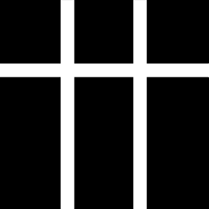
Let's add 3 columns (vertical tracks) and 2 rows (horizontal tracks). It doesn't matter how many child elements we have. Invisible grid tracks will be created no matter what.
<div class="grid g-column-3 g-row-2">
  <p>1</p>
  <p>2</p>
</div>
1
2
Gap
We need some spacing between our grid children. Let's add .gap-5 to the parent element. This corresponds
to a gap size of 1vw. Gap utilities in hgrid are counted from .gap-1 to .gap-19
and include both fixed (px and rem) and flexible (vw) values.
Note: .gap-{*} applies equal margin to all sides of child elements. If you want a different gap between columns and rows,
use .column-gap-{*} and .row-gap-{*} respectively.
// Array of included gap widths

$gaps:
  1px,
  0.4vw, 0.6vw, 0.8vw, 1vw, 1.6vw, 2vw, 2.6vw, 3vw,
  0.2rem, 0.4rem, 0.6rem, 0.8rem, 1rem, 1.2rem, 1.4rem, 1.6rem, 1.8rem, 2rem;
Let's also add enough child items to fill the 3 x 2 tracks:
<div class="grid g-column-3 g-row-2 gap-5">
  <p>1</p>
  <p>2</p>
  <p>3</p>
  <p>4</p>
  <p>5</p>
  <p>6</p>
</div>
Result:
1
2
3
4
5
6
Grid Column Span
.g-column-span-{*} defines the width of a grid child, counted by how many tracks it spans.
<div class="grid g-column-3 g-row-2 gap-5">
  <p>1</p>
  <p class="g-column-span-2">2</p>
  <p class="g-column-span-3">3</p>
  <p>4</p>
  <p>5</p>
  <p>6</p>
</div>
1
2
3
4
5
6
Grid Column Start/End
The grid pattern above could also be achieved with .g-column-start-{*} and .g-column-end-{*} (although
this is not their main purpose – more about that later).
In order to make a column span the two last tracks of a three track grid, we start with .g-column-start-2
and end it with .g-column-end-4. The column ends when it hits the fourth vertical grid line from the left,
hence the value 4 and not 3.
If no end position is declared, the column will span a single track.
<div class="grid g-column-3 g-row-2 gap-5">
  <p>1</p>
  <p class="g-column-start-2 g-column-end-4">2</p>
  <p class="g-column-start-1 g-column-end-4">3</p>
</div>
1
2
3
Push Columns Along the Grid Track
The main purpose of .g-column-start-{*} and .g-column-end-{*} is to push columns to another position
along their tracks. This leaves empty spaces:
<div class="grid g-column-2 g-row-2 gap-5">
  <p class="g-column-start-2 g-column-span-2">1</p>
  <p>2</p>
  <p class="g-column-start-3">3</p>
</div>
1
2
3
Row Span
.g-row-span-{*} defines the height of a grid child, counted in rows.
<div class="grid g-column-3 g-row-3 gap-5">
  <p class="g-row-span-3">1</p>
  <p>2</p>
  <p class="g-row-span-2">3</p>
  <p>4</p>
  <p>5</p>
  <p>6</p>
</div>
1
2
3
4
5
6
Grid Row Start/End
The purpose of .g-row-start-{*} and .g-row-end-{*} is to pull rows from their natural grid position and
force them into a new position along their vertical tracks.
Just as for grid columns, start and end positions for rows relate to grid lines. A row starts at the grid line at
its top and runs to the line at its bottom. If we want to span the full height of two grid tracks, we start with
.g-row-start-1 and end with .g-row-end-3. The row hits the end of its allocated span on the
third horizontal grid line from the top.
A CSS grid will by default pack the elements as tight as possible from left to right and try to avoid empty spaces.
<div class="grid g-column-3 g-row-3 gap-5">
  <p class="g-row-start-1 g-row-end-3">1</p>
  <p class="g-row-start-2 g-row-end-4">2</p>
  <p class="g-row-start-3">3</p>
  <p>4</p>
  <p>5</p>
  <p>6</p>
</div>
1
2
3
4
5
6
Grid Auto Flow
We can change the flow direction from horizontal (.g-flow-row, the default) to vertical by adding
.g-flow-column to the grid parent. The same code as above now looks like this:
1
2
3
4
5
6
This grid is only three tracks wide. An extra, implicit grid track is automatically created to the right, in order to arrange the three items it couldn't otherwise place. Grid children will never be hidden or deleted, space will always be created for them in the form of an implicit grid if need be.
(To be continued)
← Previous: Flex
Next: Tables →