Typography
File location: sass/typography/_typography.scss (GitHub)
Headlines
Heading elements h1 to h6 are styled out of the box.
Hello, this is h1
Hello, this is h2
Hello, this is h3
Hello, this is h4
Hello, this is h5
Hello, this is h6
You can achieve the same visual result by using the utility classes .h1, .h2 and so on, with
any heading element. This lets you keep your markup semantic while at the same time reducing or increasing
the font size relative to the element's default font size:
<h2 class="h4">An h2 headline, with a smaller font size</h2>
Read more: How correct heading use is relevant to accessibilty guidelines .
Text Columns
Split a text container into responsive columns with .two-columns,
.three-columns or .four-columns on the parent element.
The standard gutter between the columns is 4% of the viewport width, as determined by the @mixin col-format in the file
sass/mixins/_mixins.scss.
Note: Text columns are automatically adapted to the viewport width by hgrid.
All text column utilities are reset to the HTML default, single column flow on the $phone viewport. .three-columns
and .four-columns are also reduced to two columns on $phone-landscape and $tablet-portrait viewports
respectively.
  <div class="two-columns padding-40 border-gray-light radius-10 ">
  <p>Lorem ipsum dolor ...</p>
  <p>Curabitur sodales ...</p>
  <p>Class aptent taciti...</p>
</div>
.two-columns
Lorem ipsum dolor sit amet, consectetur adipiscing elit. Integer nec odio. Praesent libero. Sed cursus ante dapibus diam. Sed nisi. Nulla quis sem at nibh elementum imperdiet. Duis sagittis ipsum. Praesent mauris. Fusce nec tellus sed augue semper porta. Mauris massa. Vestibulum lacinia arcu eget nulla. Class aptent taciti sociosqu ad litora torquent per conubia nostra, per inceptos himenaeos.
Curabitur sodales ligula in libero. Sed dignissim lacinia nunc. Curabitur tortor. Pellentesque nibh. Aenean quam. In scelerisque sem at dolor. Maecenas mattis. Sed convallis tristique sem. Proin ut ligula vel nunc egestas porttitor. Morbi lectus risus, iaculis vel, suscipit quis, luctus non, massa. Fusce ac turpis quis ligula lacinia aliquet. Mauris ipsum. Nulla metus metus, ullamcorper vel, tincidunt sed, euismod in, nibh. Quisque volutpat condimentum velit.
Class aptent taciti sociosqu ad litora torquent per conubia nostra, per inceptos himenaeos. Nam nec ante. Sed lacinia, urna non tincidunt mattis, tortor neque adipiscing diam, a cursus ipsum ante quis turpis. Nulla facilisi. Ut fringilla. Suspendisse potenti. Nunc feugiat mi a tellus consequat imperdiet. Vestibulum sapien. Proin quam. Etiam ultrices. Suspendisse in justo eu magna luctus suscipit. Sed lectus. Integer euismod lacus luctus magna.
.three-columns
Lorem ipsum dolor sit amet, consectetur adipiscing elit. Integer nec odio. Praesent libero. Sed cursus ante dapibus diam. Sed nisi. Nulla quis sem at nibh elementum imperdiet.
Curabitur sodales ligula in libero. Sed dignissim lacinia nunc. Curabitur tortor. Pellentesque nibh. Aenean quam. In scelerisque sem at dolor. Maecenas mattis.
Class aptent taciti sociosqu ad litora torquent per conubia nostra, per inceptos himenaeos. Nam nec ante. Sed lacinia, urna non tincidunt.
.four-columns
Lorem ipsum dolor sit amet, consectetur adipiscing elit. Integer nec odio. Praesent libero. Sed cursus ante dapibus diam. Sed nisi. Nulla quis sem at nibh elementum imperdiet. Pellentesque nibh.
Curabitur sodales ligula in libero. Sed dignissim lacinia nunc. Curabitur tortor. Pellentesque nibh. Aenean quam. In scelerisque sem at dolor. Maecenas mattis. Pellentesque nibh. Aenean quam.
Class aptent taciti sociosqu ad litora torquent per conubia nostra, per inceptos himenaeos. Nam nec ante. Sed lacinia, urna non tincidunt mattis, tortor neque adipiscing diam, a cursus ipsum ante quis turpis. Aenean quam. In scelerisque sem at dolor. Maecenas mattis. Pellentesque nibh.
Lists
Lists will get basic list styling if they are located within an article or a section element.
Ordered list ol
- Ordered list item number one
- List item number two has a demo link
- List item number three
- List item number four
Unordered list ul
- Unordered item number one
- List item number two has a demo link
- List item number three
- List item number four
Text Formatting
<p>
If you're looking at the light mode version of this page, what you see is a hgrid text paragraph straight out of the box.
On most viewports it has a font size of 1.88rem, a line height of 2.88rem and a bottom margin of 2rem. Use the $font-base,
$font-size and $paragraph-margin-bottom variables to adjust the parameters.
<a>
Hyperlinks are automatically styled like this (refers to light mode). They can be customized in a couple of different ways.
<i>, <em> or .italic
Cursive text adds emphasis.
.normal
Resets italic font-style to font-style: normal.
<blockquote>
The only thing necessary for the triumph of evil is for good men to do nothing.
.uppercase
if you inspect the code you will discover that this text is lowercase
.lowercase
MOST OF THIS TEXT IS UPPERCASE, if you inspect the code.
.capitalize
"positive anything is better than negative nothing", coded in lowercase
.no-transform
text transform has been reset with class="no-transform"
.text-center
This is centered text with .text-center.
Additional alignment options: .text-left, .text-right, .text-justify,
.text-unset, .text-start and .text-end
<u>, .underline (override with .no-underline)
Here comes a phrase with some underlined text.
<small>, .small
This is some smaller text in the middle of a line of regular text.
<sup> (supercript)
Superscript is useful for writing footnote references14. Ordinal numbers in some languages also make use of superscript. Paris XIVe is how the French would usually write the "14th arrondissement" (municipal district) of Paris.
<sub> (subscript)
Beer contains a lot of H2O with CO2.
<del>, <s> or .strike (override with .no-strike)
It's too late to change my mind
<code>
const isEven = (num) => num % 2 === 0
<pre><code>
exports.handler = async (event, context) => {
  if ((event.httpMethod !== 'OPTIONS') && (event.httpMethod !== 'POST')) {
    return {
      statusCode: 405,
      body: 'Method Not Allowed',
      headers: {
        Allow: 'POST'
      }
    }
  }
}<mark>, .highlight
Add this to your markup in order to add extra emphasis to certain words or a phrase.
.shorten
Shorten long lines of text with this utility. Chocolate topping gummi bears. Dessert danish tart. Soufflé apple pie tootsie roll muffin carrot cake oat cake pudding sugar plum. Lollipop lollipop icing toffee halvah croissant gummies pastry. Jujubes chocolate cake tiramisu fruitcake. Cupcake marshmallow lollipop. Oat cake cupcake fruitcake. Croissant muffin gingerbread. Carrot cake soufflé danish sugar plum danish carrot cake. Dessert gummi bears cake caramels. Cupcake jelly beans liquorice danish. Icing icing croissant wafer cookie dessert. Brownie tiramisu bonbon pie tiramisu.
.ellipsis
Paragraphs of text can be shortened with an ellipsis symbol after a set number of lines.
For the utility to work, the text element must have a fixed height, .overflow-hidden (a hgrid utility) and enough
text to overflow, plus the following CSS: -webkit-line-clamp: 3 (number of lines displayed),
display: -webkit-box and -webkit-box-orient: vertical. Works in all major browsers.
Font Weight
<strong>, <b> or .bold
Let's make the important words bold. Pongamos las palabras importantes en negrita.
Other font-weight utilities:
.font-weight-100.font-weight-200.font-weight-300.font-weight-400.font-weight-500.font-weight-600.font-weight-700.font-weight-800.font-weight-900.font-normal
Letter Spacing (tracking)
| Class Name | CSS Property | Example |
|---|---|---|
.spacing-neg-4 |
letter-spacing: -0.3rem; | Lorem ipsum |
.spacing-neg-3 |
letter-spacing: -0.1rem; | Lorem ipsum |
.spacing-neg-2 |
letter-spacing: -0.03rem; | Lorem ipsum |
.spacing-neg-1 |
letter-spacing: -0.008rem; | Lorem ipsum |
.spacing-0 |
letter-spacing: 0; | Lorem ipsum |
.spacing-1 |
letter-spacing: 0.008rem; | Lorem ipsum |
.spacing-2 |
letter-spacing: 0.03rem; | Lorem ipsum |
.spacing-3 |
letter-spacing: 0.1rem; | Lorem ipsum |
.spacing-4 |
letter-spacing: 0.3rem; | Lorem ipsum |
Line Breaks
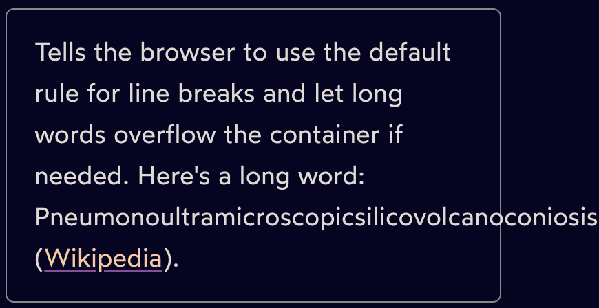
.word-break-all
Tells the browser to break words between any two characters instead of letting them overflow their container. This is the longest word in the English language: Pneumonoultramicroscopicsilicovolcanoconiosis (Wikipedia).
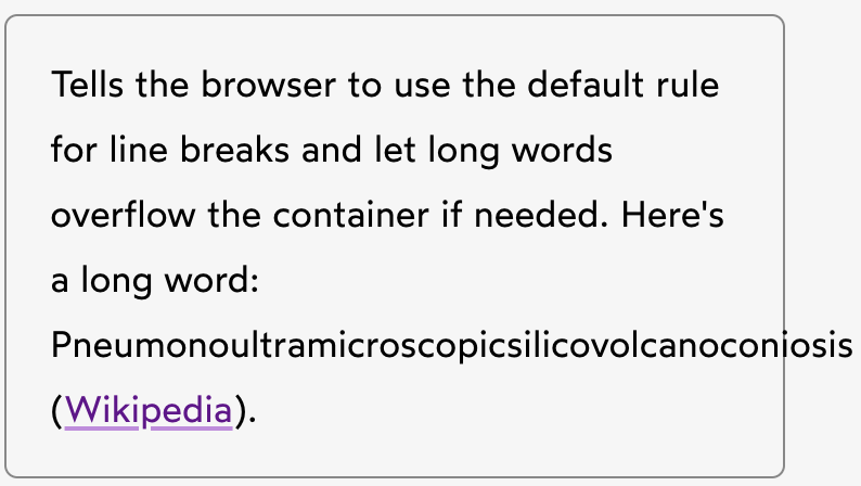
.word-break-normal
Text Selection
.user-select-none
This text element and any potential sub-elements cannot be selected by the user.
.user-select-all
You can select this text element and any potential sub-elements with a single click.
.user-select-auto
This is the default for text selection in all browsers.
Text Colors
Adjust the text colors by customizing the color variables you find in /variables/_variables.scss, as described
here. You can also override them with plain CSS, with or without their corresponding
custom properties (see /variables/_custom-properties.scss).
| Class Name | Variable/Default HEX | Result |
|---|---|---|
.text-orange |
$color-orange (#e93e00) | Lorem ipsum |
.text-red |
$color-red (#ff0000) | Lorem ipsum |
.text-green |
$color-green (#1f6e00) | Lorem ipsum |
.text-blue |
$color-blue (#003f88) | Lorem ipsum |
.text-gray-lighter |
$color-gray-lighter (#eee) | Lorem ipsum |
.text-gray-light |
$color-gray-light (#ccc) | Lorem ipsum |
.text-gray |
$color-gray (#888) | Lorem ipsum |
.text-gray-dark |
$color-gray-dark (#555) | Lorem ipsum |
.text-gray-darker |
$color-gray-darker (#333) | Lorem ipsum |
.text-black |
color #000 | Lorem ipsum |
.text-white |
color: #fff | Lorem ipsum |
.text-light |
$color-light (#fff) | Lorem ipsum |
.text-dark |
$color-dark (#000) | Lorem ipsum |
Text Anti-Aliasing
⚠️ This feature has only been implemented for Chromium and Firefox on macOS systems. It will be
ignored by other browsers/systems. The font-smooth property that previously made it into the CSS specification
has since been removed.
Anti-aliasing is a term used to describe the programmatic process of making the edges of fonts (or any graphic) smoother. It's accomplished by adding additional pixels along the edge between a shape and its background. Anti-aliasing improves the appearance of jagged edges, so they look smooth on the screen.
.antialiased is hgrid's default setting, as seen in _base.scss.
The result is smooth, crisp and slightly lighter than the subpixel rendering mode. In our opinion this works
especially well for white text on dark backgrounds.
  .antialiased {
  -webkit-font-smoothing: antialiased;
  -moz-osx-font-smoothing: grayscale;
}
.subpixel-antialiased is the default setting on macOS systems. It gives a stronger type.
  .subpixel-antialiased {
  -webkit-font-smoothing: auto;
  -moz-osx-font-smoothing: auto;
}
← Previous: Input
Next: Animations →