Lines & Borders
File location: layout/helpers/_separation.scss (GitHub)
Horizontal Separators
<hr>
.hairline
.hairline-darker
Borders
.border-light
.border-white
.border-gray-lighter
.border-gray-light
.border-gray
.border-gray-dark
.border-gray-darker
.border-dark
.border-black
Additionally: .border-transparent and .border-none
Colors for border-dark and border-light can be customized with the hgrid variables
$color-light and $color-dark in the @use rule during
initialization.
Individual Borders
.border-top-gray
.border-right-gray
.border-bottom-gray
.border-left-gray
.border-gray .border-top-none
.border-top-gray-dotted
.border-right-gray-dotted
.border-bottom-gray-dotted
.border-left-gray-dotted
.border-gray .border-dotted .border-top-none
This pattern works with the five grayscale colors we already know, but with simpler naming, as well as -none:
-lighter (gray-lighter), -light (gray-light), -gray, -dark
(gray-dark) and -darker (gray-darker).
Code example
<div class="border-right-darker">
  <!-- element content -->
</div>

<div class="border-top-dark-dotted">
  <!-- element content -->
</div>

<div class="border-gray border-left-none">
  <!-- element content -->
</div>
Border Modifiers
The border modifiers require that the element has a border. For example by the help of one of hgrid's border or line utilities. The modifier must come after the initial border in the html sequence.
⚠️ Some of the modifier effects can be hard to see if the border line is too thin. The modifiers depend on the browser's implementation of standard CSS properties and may consequently look slightly different from browser to browser.
<div class="border-gray-dark border-dashed">
  <!-- element content -->
</div>

<hr class="border-dotted">
.border-dotted
.border-dashed
.border-double
.border-groove
.border-ridge
.border-inset
.border-outset
.border-ridge
.border-inset
.border-thin
.border-medium
.border-thick
.border-2px
.border-3px
.border-4px
.border-5px
.border-6px
.border-10px
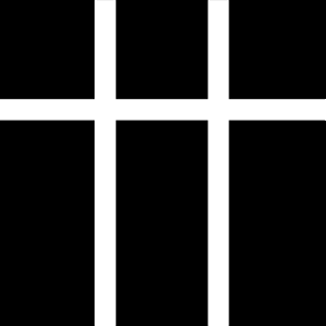
Text Column Separators
Add the utility .col-rule-gray-light to a multi-column text container and light gray lines will show up
between each column. More about text columns in the typography chapter.
Lorem ipsum dolor sit amet, consectetur adipiscing elit. Integer nec odio. Praesent libero. Sed cursus ante dapibus diam. Sed nisi. Nulla quis sem at.
Curabitur sodales ligula in libero. Sed dignissim lacinia nunc. Curabitur tortor. Pellentesque nibh. Aenean quam. In scelerisque sem at dolor.
Class aptent taciti sociosqu ad litora torquent per conubia nostra, per inceptos himenaeos. Nam nec ante. Sed lacinia, urna non maecenas tincidunt.
The naming pattern is .col-rule-{ color-name } with these values: light, white,
gray-lighter, gray-light, gray, gray-dark, gray-darker,
dark and black. (dark and light can be customized with the variables
$color-light and $color-dark.)
Responsive Border Overrides
Remove borders responsively:
| Class Name | CSS Property | Comment |
|---|---|---|
.{ viewport }-b-0 |
border: none; | Example: tablet-portrait-b-0 |
.{ viewport }-bt-0 |
border-top: none; | Example: desktop-large-bt-0 |
.{ viewport }-bb-0 |
border-bottom: none; | Example: phone-bb-0 |
.{ viewport }-br-0 |
border-right: none; | Example: laptop-br-0 |
.{ viewport }-bl-0 |
border-left: none; | Example: phone-landscape-bl-0 |
Supported viewports:
desktop-largedesktoplaptoptablet-landscapetablet-portraitphone-landscapephone
← Previous: Background
Next: Shapes